8530 Quarters Lake Road
Baton Rouge, LA 70809
225.928.9999
We’ve all had the experience of pulling up a site on our phones. You pinch and push to try to get to the content you want, meanwhile you press every button on the page and get taken away from your site and you just get frustrated. Well, we can fix that.
What is responsive design?
I’m sure you’re aware, but if not there’s a lot of hype around this term – Responsive Design or #rwd – right now. Look around anywhere on the net and you’ll see this talked about in some form or another. I mean really, all we need is another LinkedIn post about this right? Or… maybe that’s just me in my web developer world.
Regardless of what world you live in, Responsive Design is all around you. But what does it mean? Simply put, it’s design that responds to your device. If we look at that more in depth what it really means is – you should get the same quality experience when you look at a site on your nice shiney new 27” iMac as you do when you look at the site on your nice new iPhone.
(I’m currently taking donations going toward the purchase of both of those items.)
Why responsive design?
That certainly sounds nice. We all want wonderful experiences regardless of our device, but why devote the resources to phones? Well here’s why:
There are more mobile devices built each year than there are babies born. By the end of 2013, there will be more mobile devices on earth than there are people (source).
Let that sink in.
How do you respond?
Heh, nice pun right?
Well, it’s easy and we have it on lock here at X. The ideas of Responsive Design are not that much different than traditional printed mediums. In fact, I’d argue that they’re exactly the same. Take a brochure, or any tactile printed medium, and you have more real estate – and thus – more time to display information. This is our iMac, or really any desktop. Next, take a billboard or fleet graphic, you have less real estate and less time to display information. This is our iPhone.
A lot of the discourse about Responsive Design is in a sort of buzzword fashion, or people impressed with how nice it looks when you resize your browser window and the content falls into place (try this blog out yourself, resize your browser window to be about the same size as a phone). Make no mistake, at any given time you might see me doing exactly that. But that’s not what makes a responsive site successful.
It’s not our designs that respond, it’s our content. Just like the analogy of the printed medium – we keep your brand in tact while we streamline information to your users.
OK, that all sounds good, but actions speak louder right?
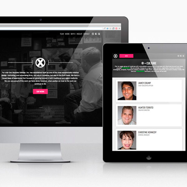
Yes they do. So instead of telling you all about our history in creating flexible content for all sorts of mediums, how about I just show you? Pull up each of these sites on both your desktop machine and your mobile device.
And of course, the site you’re currently on.
- Gibby | #TeamXdesign Interactive Designer | @thatgibbyguy
XDesign, Inc.
8530 Quarters Lake Road
Baton Rouge, LA 70809
225.928.9999