8530 Quarters Lake Road
Baton Rouge, LA 70809
225.928.9999
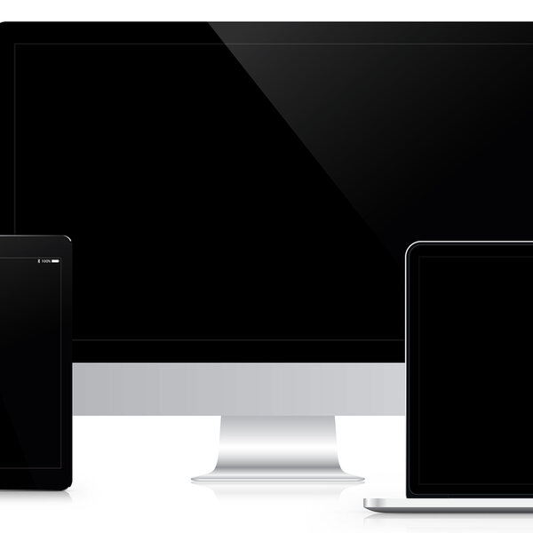
Each day, more and more mobile devices are released to the public, bringing with them an increase in the number of people who do most, if not all, of their day-to-day web browsing from their phones, tablets, phablets and smartwatches. While this may make users’ lives easier, it poses a little bit more of a challenge to web developers who are tasked with ensuring that each site is easily accessible from any and all of the aforementioned devices.
While many sites claim to be responsive across platforms, a number of them are not actually responsive but adaptive. That’s the same thing, right? Wrong.
The term “responsive” has become more and more distorted as a result of the influx of new devices produced. As opposed to a fluid site which gracefully changes to any screen regardless of device, adaptive sites provide predetermined pixel widths, coinciding with popular devices such as an iPad or iPhone.
The problem with that is it’s impossible to lump together all phones, tablets, etc. into one category because of the wide range of screen sizes. Some phone screens are bigger than those of some tablets, and some tablet screens are larger than some computer monitors.
So how do we navigate this? Instead of using classifications such as tablets, desktops and wearables, we need to focus more on the actual screen. Is it a large screen? A micro-screen? A small screen? While this change may seem subtle, it makes a world of difference to provide your site with multiple pixel dimension variations so that it will appear best to each individual user on any device.
Touch elicits a much more personal connection between human and machine than through clicking a mouse. Users are therefore inherently more engaged through direct contact as opposed to an indirect pointing device. This knowledge is a great tool for web developers when creating new sites. Easily harness users’ heightened level of engagement to increase conversions by developing a site with usability and calls-to-action that result in instant gratification upon interacting, as well as a design with enough room for users to navigate.
It’s also important to keep in mind that touch isn’t limited to smaller screens anymore. With devices that detach from their keyboards or don’t have a literal keyboard at all are breaking the myth of discounting a touch feature on larger displays. Be sure that the same thought of touch and steering your user to perform a specific task translates across all sizes.
Like everything else in technology, the state of responsive design is fluid, and designers and developers must embrace the challenge of keeping up. Right now, this includes learning how to engage users through wearables. In the near future, it’ll mean virtual and augmented reality, but we’ll save that for another day. Regardless of device classification or screen size, every user wants a memorable experience. If you don’t give it to them, they’ll find it somewhere else.
XDesign, Inc.
8530 Quarters Lake Road
Baton Rouge, LA 70809
225.928.9999