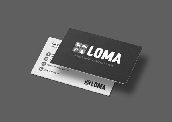
8530 Quarters Lake Road
Baton Rouge, LA 70809
225.928.9999
If you’ve ever seen the Wizard of Oz, you know the famous scene of Dorothy waking up to a technicolor world. A realm drenched in black and white is transformed to red ruby slippers, a poppy field and the Emerald City. With every twist and turn of the Yellow Brick Road, there are pops and blends of a full rainbow of colors. Want to know something crazy? Each of those colors has a specific name thanks to the PANTONE MATCHING SYSTEM® (PMS).
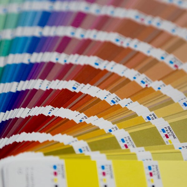
History of Pantone Colors
Founded in the 1950s, Pantone originally produced color cards for cosmetic, fashion, industrial and medical companies. During this time, companies were limited by the number of shades that could be used, and there was no guarantee the product name produced under a different firm would result in the same shade. Sounds like organized chaos, right? In 1956, Lawrence Herbert, a young chemist from New York, saw that the company’s process could solve a more widespread problem: the lack of color standardization. He then bought the company in 1962, and by 1963, Pantone revolutionized the printing industry with the colorful PANTONE MATCHING SYSTEM® (PMS). This innovative tool allows for the trustworthy selection, diction and replication of consistent, accurate colors anywhere in the world. Pantone started with 10 colors in the 1950s and now has more than 10,000 today!
Photo credit: Pantone
The Pantone Brand
Pantone has become more than just a color on a piece of stock paper. The company employs color psychologists and color economists to explain the emotionality behind colors, not just the science behind creating them. This concept is a game changer for color language. Blues come to mean trust, greens embody growth and reds evoke energy. The brand has also become popular in pop culture and in younger audiences for its retro look. With the square color and black text on wide banding, Pantone’s look has become a universal design inspiration. Coffee mugs, psychology books and bikes alike have used the Pantone design to create unique pieces. Need a vacation to recharge your creativity? The Pantone Hotel in Brussels is calling your name. Be surrounded by color swatches that will surely catch your attention and spur your emotions.
Photo credit: The PANTONE HOTEL
The Design Language
So, why do we care about Pantone to begin with? Consider this. There’s a shelf of Coke bottles where every other label is a slightly different shade. Technically, all of the bottles are “red,” but they are not all the right red. This could make you think that some bottles are older than others, which leads to distrust in the brand. You stop relying on Coke (and maybe even switch to Pepsi) because of your experience with something as simple as discoloration.
We care about colors because colors aren’t just colors. There are underlying meanings to different shades and tones that no one talks about until they experience it. In an agency like ours, we want all of the companies we represent to make the best impression possible on their customers every single time they come into contact with it. We use Pantone’s unique values every single day, and it’s affected the way we think, work and act. We’ve really latched onto the importance of the system and its distinct colors as seen throughout various pieces of art in our office.
In our creative room, you’ll find a collage piece made up of every one of our represented brands’ unique colors. And using the Pantone system isn’t limited to brands! Each of our team members’ work stations is adorned with a nameplate showcasing the specific Pantone color that best fits their personality. That’s why, even though our office is primarily women, PMS is our friend here. We even have a poster to prove it.
XDesign, Inc.
8530 Quarters Lake Road
Baton Rouge, LA 70809
225.928.9999