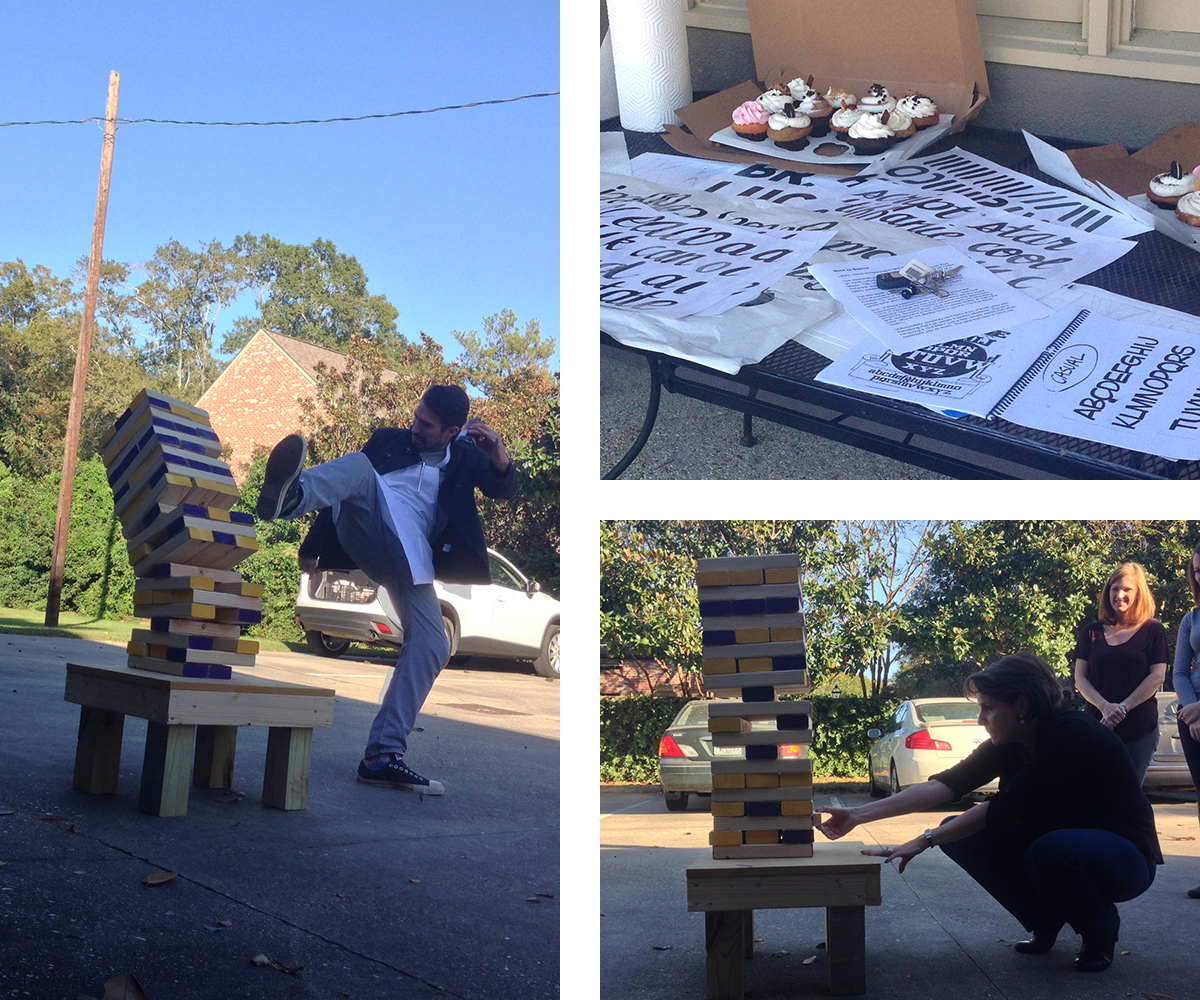
Fridays at Four are Xdesign’s group hangout sessions in which we set out to learn something new and improve the team. These discussions can range from a TED Talk to the latest in design or typography trends, to just taking a break to sit outside in the sun. This is Tiffanie Pitre's talk on the importance of simplicity.
Lately, I have found myself going “back to the basics” of design.
Two weeks ago, I participated in a two-day workshop on Hand Lettering taught by Sign Painters’ very own Mike Meyer. During the 16-hour course no one was given a computer to work from. Instead, we got our hands dirty at easels with rulers, pencils and paint brushes to create letterforms from scratch.
Just last week I spoke to an advertising class at the LSU Manship School of Mass Communication on “The Fundamentals of Design.” The presentation covered Design 101 basics like using a grid, proportion, typography, and color theory.
Both of these experiences reminded me of the importance of fundamentals and simplicity… and how most of the things we see and experience are the exact opposite. Our brains instantly respond to and appreciate simplicity. Stripped down, clear messages are refreshing and recognizable in this world of visual clutter. If that’s the case, why do we always tend to go with the “more is more” route?
Unfortunately, simplicity isn’t easy. A lot of work goes into something that’s so simple it seems effortless. “Just do it”, “I’m lovin it”, “Got Milk?” These are just a few, simple words that when combined, say so much.
The idea that less is more not only applies to advertising campaigns and taglines but also to graphic design. Our eyes are drawn to balanced designs that use white space and a few bold key elements.
The next time you are working on a project, challenge yourself to go back to the basics. Take away the clutter and strip down your solution to its simplest, purest form. Challenge yourself to narrow your focus, and I bet in the end, you will have a more memorable and impactful idea than when you started.

I would expect most people have experienced that fear and dread of pulling out a Jenga block, expecting the once sturdy tower to crumble before them. It’s a game of strategy and skill, challenging the players to avoid the tower’s weak points and rely on the tower’s load-supporting blocks.
As part of our Friday at 4 “Back to Basics” theme, we used this fun (and stressful) game as a little reminder to take away the clutter. Sturdy ideas are built on simple solutions, very much like Jenga at the start of the game. As you continue to add more blocks on top of the tower, it becomes less stable, much like an idea or design solution when there are too many pieces and parts.
As we discover over and over again here at X, the simplest solution is usually the most effective one.
-Tiffanie
XDesign, Inc.
8530 Quarters Lake Road
Baton Rouge, LA 70809
225.928.9999