

8530 Quarters Lake Road
Baton Rouge, LA 70809
225.928.9999
Typefaces and fonts have a personality. They establish a mood as well as create an atmosphere. It is these traits that lead a designer to choose and combine typefaces depending on the audience or project at hand. By selecting appropriate typefaces, designers convey what is important as well as the order a document should be read, also known as the hierarchy of information.
Knowing a few things about typography will aid you in selecting the typeface that most effectively communicates your message and any additional meanings beyond the words themselves. With this post, you will learn the basics of type anatomy and typefaces as well as things to consider when selecting a typeface. And it’s your lucky day! With this post, you also get an awesome Xdesign typography poster that you can refer to in the future. Print it, hang it, and share it with your friends and coworkers.
So here it is… your crash course on typography.
You can download the poster here
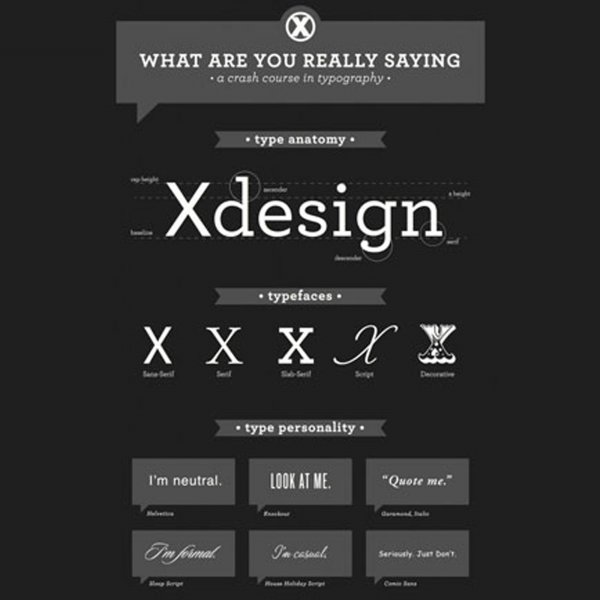
Anatomy of Type:
Base Line: The Base Line is the line that all the letters “sit” on.
Cap Height: Cap Height is the distance from the top of the capital letter down to the baseline.
X-Height: The X-height is the height of the main body of lowercase letters, or the height of the lowercase “x.” Some elements might slightly extend above or below the x-height.
Descender: The Descender is the portion of some lowercase letters that extends below the baseline.
The Ascender: The Ascender is the “stem” that extends above the x-height.
Serif: The Serif is the stroke found at the end of the main vertical and horizontal strokes of some letters.
Typefaces:
Sans-Serif: A Sans-Serif typeface refers to any style of type that is without serifs.
Serif: Serif typeface refers to any style of type that has serifs.
Slab-Serif: A Slab-serif typeface refers to any style of type that has thick, block-like serifs.
Script: A Script typeface imitates calligraphy or handwriting.
Decorative (Display): Decorative typography, or sometimes known as display typography, refers to a style of type that is more artistic and embellished.
Things To Consider When Selecting A Typeface:
Mood: Your Typeface’s Personality: Mood refers to the implied meaning or impression. A typeface can have a cheerful appearance that applies humor or happiness, a dynamic appearance that conveys motion, or anything in between. Mood is very powerful, and it can either strengthen your message or send the wrong message entirely. To successfully illustrate and represent your design’s overall message, you must match the typeface’s personality to the intended emotional response or meaning of the message. Also, keep in mind the meaning of the words themselves when picking a typeface. Experimenting with the same phrase in different typefaces and styles is a good way to find the typeface that suits your message the most. The example below demonstrates how the headline, “Pump It Up,” would be more appropriate in a Sans-Serif bold typeface rather than a soft, Script font.
Legibility and Readability: For large bodies of text, pick a legible typeface that is easy on the eyes and can be easily read. As seen in the example below, decorative fonts can be great for headlines; but, they don’t function as well for body text when there are large amounts of text to be read.
Also, make sure there is enough contrast between the text and background colors. For example, black text on a white background can be easily read where as yellow text on a white background is not. Can you read that? Probably not. As you can see, picking a contrasting text color and background color is important in readability.
Hierarchy: Your font choice, as well as layout, plays an important role in the hierarchy of your design. In one design, you might need multiple typefaces and fonts in different sizes, weights, and styles to make the distinction between headlines, sub-headings, quotes, and main body copy. Use the example below as a guideline on how to handle headlines, quotes, and body text.
As you can see, headlines, usually largest in size, tend to be a bolded Display or Serif typeface. Quotes and call-outs are usually an italic Serif. Body copy can be a serif or non-serif, depending on whether it is a printed material or document for the web. While you can use both Serifs and Sans-Serifs for printed pieces, it is recommended to use a Sans-Serif for smaller text on the web, like Arial or Verdana, due to the fact that some displays do not cleanly render serifs.
Use a Limited Palette: There are thousands upon thousands of typefaces available for use, with more being added and created everyday. Just because you have a multitude of options, doesn’t mean you have to use 10 different fonts in one design though. Although some designs call for multiple typefaces, a good rule of thumb is not to exceed 2-3 fonts in one piece. Too many typefaces can be distracting and decrease readability rather than enhancing the design and complimenting the overall message.
I hope this post helps you in the future to successfully illustrate and represent your design’s overall message through your selection and combination of typefaces.
Design on.
- Tiffanie Pitre | @tiffaniepitre
XDesign, Inc.
8530 Quarters Lake Road
Baton Rouge, LA 70809
225.928.9999
